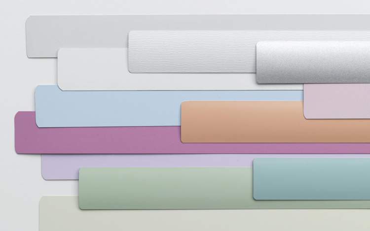
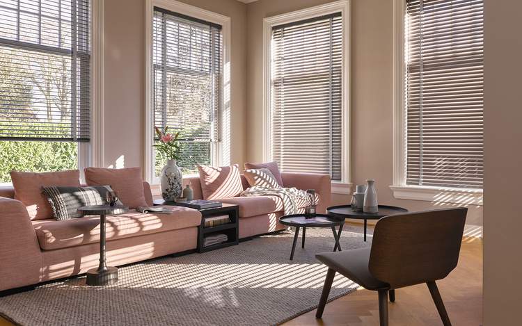
“Whether in soft or hard surface material, the pairing of Rose Quartz and Serenity brings calm and relaxation. Appealing in all finishes, matte, metallic and glossy, the engaging combo joins easily with other mid-tones including greens and purples, rich browns, and all shades of yellow and pink. Add in silver or hot bright tones for more splash and sparkle.”
This is great news for our homes as we have an array of colours within all of our collections for you to chose from which are perfect for the Pantone® selection.
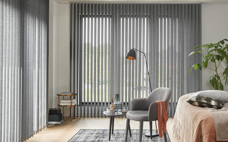
Serenity is weightless and airy, like the expanse of the blue sky above us, bringing feelings of respite and relaxation even in turbulent times. Luxaflex® Vertical Blinds look stunning in this serene soft fabric.
