Pastel Accent Colours And Powdery Hues

  • Trends

Chalky, pastel hues have always been a favourite for interiors, elevating delicate rooms into light and airy spaces which are easy to live in. The trick is to not make it too sugary and create a grown-up scheme by adding powdery hues with a bold statement colour or gorgeous textures.

Soft Accents

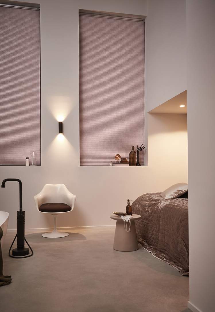
Pastels are less saturated than primary colors, making them feel light, soft, and calming.

For spring, they work well with neutral colors to create a feeling of earthiness and sophistication. Pastel accessories look great paired with white walls and plain furniture.

We love the way these soft pink Venetian Blinds play with the light, creating a sophisticated look in the stylish living room.

Duette® Shades Duette® Shades

Soften Your Bathroom

Bathrooms don’t need to be white so take a tone like chalky pale pink to add a subtle colour to your room.

This Luxaflex® Duette® Shade in room-darkening fabric softens these extra-large windows and adds much need privacy and light control in one. Add simple bathroom accessories and enjoy the serenity!

Venetian Blinds Venetian Blinds

Blue Hues

Light pastel blue Venetian Blinds can make a room feel airy, a small room appear larger and a room with limited natural light feel brighter.

According to colour psychology blue promote feelings of tranquillity and light blue’s gentle appearance hue is particularly likely to create a calming feeling in a space.

Duette® Shades Duette® Shades

Golden Hues

Use golden shades to create spaces that are rich and cosy whilst remaining sophisticated.

Adding smaller accessories in different tones is a great way to embrace the trend.

Add vintage-inspired glassware that will inject a shot of glamour to the everyday.

The colours you choose make a massive difference to the tone of your interiors.

Learn more about the available colours of our blinds and shades.